
Logitech App Design
UX Design Project
Case Study
2022

The Product
This app was designed as part of the project to bring the Logitech desktop website store as a standalone shopping app
Project Overview
Project Duration
September 2022 - November 2022
Methodology | Initial Stages
Phases of the Design Thinking Process
Empathize
Define
Ideate
Prototype
Test
The above phases were incorporated throughout the project. Each phase went through a series of iterations to approach to the final solution.
Research
Recent studies show that 90% of the mobile time is spent in apps and remaining 10% is spent browsing the web.
In the e-commerce space, mobile app users spend 201.8 minutes on an average per month shopping compared to a mere 10.9 minutes/month for website users
Growth of Mobile e-commerce apps
Mobile Browser
Desktop Browser

2x
Mobile Application
Mobile users associate apps with helping them save time and make life more convenient. Because they find that their smartphones are more accessible rather than tablets or laptops.
1. Empathizing the user
User Reseach Summary
User research was conducted to understand their behavior, pain points and preferences. Methods used to conduct research includes
Primary research methods like
-
Interviews
-
Competitive Audit
-
Survey
Secondary research methods such as
-
Websites
-
Articles
Personas

Carl
Age: 35
Education: College Graduate
Hometown: London, UK
Family: Stays with his parents
Occupation: Architect
“Any design should be functional first, be it
buildings or products”
Goals
● Find better gadgets for
his home and studio
● Provide knowledgeable
info about the current
hardware tools to his
coworkers
● Also responsible for
equipping the studio
with better equipment
Frustrations
● Finds it hard to sort out
information in
compare sections in
existing shopping apps
● Information sections
are too cluttered and
finds it hard to narrow
down features
Carl is a junior architect at an architecture firm based out of London, UK and lives at his parents' place. He has been asked to understand the studio’s current technology and make necessary upgrades within a budget. He usually visits
apps such as Best Buy and Target to make the final purchases.

John
Age: 22
Education: College Student
Hometown: Chicago, Illinois
Occupation: Student
“As a student, it is important to be wise while
spending a lot of money”
Goals
● Build a PC to do more
graphic intensive
content and start
freelancing as an
animator
● Due to his tight budget,
he likes to wait for sale
offers to buy products
online
Frustrations
● Finding the right
product during flash
sales could be a hit or
a miss
● Notification on flash
sales or scheduling a
purchase would be
better addition
John is a college student from Chicago, and he aims to become an animation artist in the future. For that, he requires a really powerful computer to begin with. He knows he can save money during holiday sales and flash sales since he likes to be thrifty. He wishes if there were better ways to shop in these flash sales to save a few more bucks
User Stories based on above personas
Carl's User Story
"As a professional who has to buy technology goods for his firm, I want to understand the product in precise manner so that I know I am getting the right product for the money."
John's User Story
"As a college student who is on a tight budget, I want to be always on the lookout for sale offers for PC peripherals and other PC parts so that I can save some money and invest on things that might benefit performance.
2. Defining the Problem
Observed Pain Points
Too Many Steps
Online Web stores require to open up the browser and type in the website URL to begin the process of shopping.
The extra steps may leave the user abandon the process.
Sale Anxiety
Users feel anxious during sales due to time bound shopping. Since, websites do not offer push notifications, user generally miss out on sales
Notifications
Website stores offer less options when it comes to push notifications and personalised shopping experience
Competitive Audit Conclusions
Key Competitors :


.png)
These competitors have a strong market position. Asus and Corsair offer products for a wide range of customers, while Razer Apple target a wealthier audience with their higher-priced products.
Asus and Corsair are more of enthusiast brands. People only find their websites home if they really know what they are looking for. Their websites are all about finding the product that suits your interest because they have a ton of options for almost every customer group.
Meanwhile, Razer and Apple are niche brands. You only go to buy something from their website if you are very specific to the brand. They do not have a lot of options to choose from when it comes to product types and variants.
Visiting their websites, I observed to gain some inspiration and areas that could be improved upon while designing
Cons
-
Lack of support for different languages
-
Prices not displayed for certain products
-
Could be helpful if there was a filter to sort items based on price
Pros
-
Have separate section for deals
-
Very well detailed product descriptions
-
Minimalist designs and clean aesthetic
-
Well designed website. Simple, beautiful and straightforward
The PROBLEM
Users have to go through a lengthy process of visiting the website store to buy Logitech products which could otherwise be done so using a standalone mobile app which would be more convenient and accessible
The GOAL
"To design a mobile app that will be used to buy Logitech products and replaces the website store. The focus will be on making the app more user friendly to people who look for a hassle-free online shopping experience. User readability and clear visuals will be given more focus design wise"
3. Ideation
Paper Wireframes
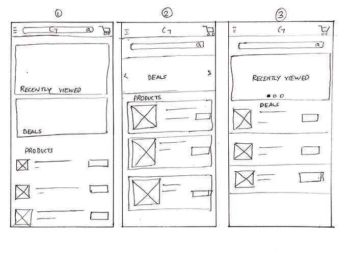


Digital Wireframes using Figma

4. Prototyping
Low Fidelity Prototype

5. Testing
Usability Study
Study Details
Research Questions
-
How long does it take for the participant to search the desirable product?
-
How often do they compare products before buying?
-
How is the procedure for payment
-
How often to they shop during deals or sales?
Participants
-
5 participants: 4 males and 1 Female
-
Age group: - 20 - 50 years old
Methodology
20 minutes per participant
United States, remote
Unmoderated Usability Study
Users were asked to test a Low Fidelity Prototype and follow some prompts to mimic a user flow
KPIs
● Time on Task
● Conversion Rates
● User error rates
● Use of Navigation vs Search
Findings
Two rounds of usability studies were conducted and the findings were noted on a spreadsheet. The feedback was recorded by measuring their click paths, ability to follow up a prompts and task conversions.
-
Users prefer the search bar
-
Use of filters while browsing
-
No prices listed in the products list page
-
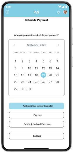
Scheduling or reminding a purchase
-
Requirement of highlighted key features in descriptions
Research insights with additional research areas
Making the Compare button easily accessible
Adding a "Key Highlights"
Feature
Schedule to buy option
Having a separate deals section
Mockups


Before the Usability Study
After the Usability Study

Figma High-Fidelity Prototype
Visual Style & Elements
